UI Component Libraries
Learn how to build customizable and reusable UI component libraries with Storybook and modern frontend frameworks. Improve your development workflow and create
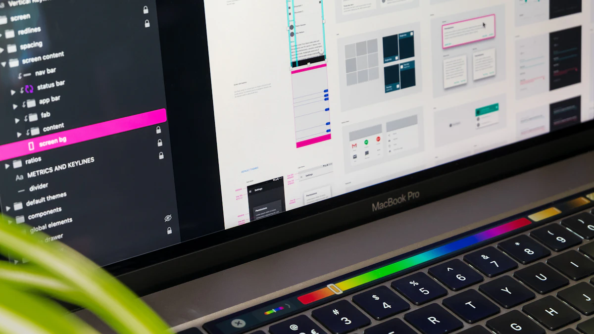
Photo by Tirza van Dijk on Unsplash
As a web designer and developer, I've worked with numerous clients across Georgia, from restaurant owners to cabinetry businesses, and one thing that's always crucial is creating a consistent user interface. That's where UI component libraries come in – a game-changer for streamlining development and ensuring brand consistency. In this article, I'll dive into building customizable and reusable UI component libraries with Storybook and modern frontend frameworks.
Introduction to Storybook
Storybook is an open-source tool for building UI components in isolation. It allows you to create, test, and document your components in a controlled environment, making it easier to develop and maintain consistent UI elements. With Storybook, you can create a library of reusable components that can be easily integrated into your web application.
One of the key benefits of using Storybook is that it enables you to develop components in a sandboxed environment, which helps to prevent conflicts with other parts of your application. This makes it ideal for teams working on large-scale projects or for developers who want to create a library of reusable components.
Setting up Storybook
To get started with Storybook, you'll need to install it in your project using npm or yarn. Once installed, you can create a new Storybook configuration file to define your component library. This file will contain metadata about your components, such as their names, descriptions, and usage examples.
npm install storybookCreating Customizable Components
When creating customizable components, it's essential to consider the various use cases and scenarios in which they'll be used. This involves thinking about the different props, states, and contexts that your components will need to handle. By doing so, you can create components that are flexible and adaptable to different situations.
A good example of this is a button component. A basic button component might have a fixed design and behavior, but a customizable button component could have props for changing its color, size, and label. This would allow you to use the same button component in different parts of your application, while still maintaining a consistent look and feel.
- Color schemes
- Typography
- Spacing and layout
Using Props and State
Props and state are essential for creating customizable components. Props allow you to pass data from a parent component to a child component, while state enables you to store and manage data within a component. By using props and state effectively, you can create components that are highly customizable and reusable.
const Button = ({ color, size, label }) => {
return (
);
};Integrating with Modern Frontend Frameworks
Storybook can be integrated with various modern frontend frameworks, including React, Angular, and Vue.js. This allows you to use Storybook's features and tools within the context of your chosen framework. For example, you can use Storybook's React integration to create and test React components in isolation.
In a recent project for a real estate client, I used Storybook to create a library of reusable UI components. This helped to streamline the development process and ensured that the client's brand was consistently represented across the web application.
Using Storybook with React
To use Storybook with React, you'll need to install the `@storybook/react` package and configure it in your Storybook setup file. This will enable you to create and test React components in Storybook, using React's context and state management features.
npm install @storybook/reactBest Practices for Building UI Component Libraries
When building UI component libraries, it's essential to follow best practices to ensure that your components are maintainable, scalable, and easy to use. This includes using a consistent naming convention, documenting your components, and testing them thoroughly.
One of the most important best practices is to keep your components simple and focused on a specific task. This makes them easier to understand, use, and maintain, and helps to prevent complexity and technical debt.
Keep it simple, stupid (KISS) is a design principle that's highly relevant to building UI component libraries. By keeping your components simple and focused, you can create a library that's easy to use, maintain, and scale.
Conclusion
In conclusion, building customizable and reusable UI component libraries with Storybook and modern frontend frameworks is a powerful way to streamline your development workflow and create consistent user interfaces. By following best practices and using the right tools and techniques, you can create a library of high-quality, reusable components that will save you time and effort in the long run.
If you're looking to improve your web development skills and create more efficient, effective, and user-friendly interfaces, I invite you to get in touch to discuss your project needs. And don't forget to check back for more articles and tutorials on web development, design, and related topics.



Comments 0
Be the first to comment.