Responsive Design Systems
Implementing responsive design systems with CSS Grid and Flexbox for complex web layouts. Learn how to create flexible, maintainable, and accessible designs.
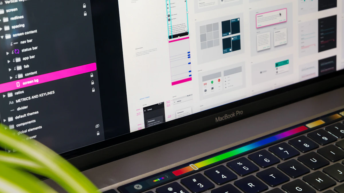
Photo by Tirza van Dijk on Unsplash
As a web designer and developer based in Woodstock, GA, I've worked with numerous clients across Atlanta and the US to create responsive, user-friendly websites that drive engagement and conversions. In this article, I'll share my expertise on implementing responsive design systems with CSS Grid and Flexbox for complex web layouts. Whether you're building a website for a local business or a national brand, these techniques will help you create flexible, maintainable, and accessible designs that improve user experience and conversion rates.
Introduction to Responsive Design Systems
A responsive design system is a set of guidelines and tools that help designers and developers create consistent, responsive, and accessible interfaces across multiple devices and screen sizes. By using a design system, you can ensure that your website looks and feels great on desktops, laptops, tablets, and mobile devices, and that it's easy to maintain and update over time.
In a recent project for a kitchen cabinet client in Atlanta, I used CSS Grid and Flexbox to create a responsive design system that adapted to different screen sizes and devices. The result was a website that was not only visually appealing but also highly functional and easy to use.
Using CSS Grid for Responsive Layouts
CSS Grid is a powerful layout system that allows you to create complex, responsive layouts with ease. By defining a grid container and grid items, you can create a flexible and adaptable layout that responds to different screen sizes and devices.
/* Define a grid container */

.grid-container {

  display: grid;

  grid-template-columns: repeat(12, 1fr);

  grid-gap: 10px;

}


/* Define grid items */

.grid-item {

  grid-column: span 4;

}
One of the key benefits of using CSS Grid is that it allows you to create complex layouts with minimal markup and styles. This makes it easier to maintain and update your website over time, and reduces the risk of errors and inconsistencies.
Benefits of Using CSS Grid
- Flexible and adaptable layouts
- Easy to maintain and update
- Reduced risk of errors and inconsistencies
Using Flexbox for Responsive Components
Flexbox is a layout mode that allows you to create flexible and responsive components that adapt to different screen sizes and devices. By using Flexbox, you can create components that are easy to use and interact with, and that provide a great user experience.
/* Define a flex container */

.flex-container {

  display: flex;

  flex-wrap: wrap;

  justify-content: center;

}


/* Define flex items */

.flex-item {

  flex-basis: 200px;

  margin: 10px;

}
One of the key benefits of using Flexbox is that it allows you to create flexible and responsive components that are easy to use and interact with. This makes it easier to create websites that provide a great user experience, and that drive engagement and conversions.
Benefits of Using Flexbox
- Flexible and responsive components
- Easy to use and interact with
- Great user experience
Implementing Responsive Design Systems with CSS Grid and Flexbox
By combining CSS Grid and Flexbox, you can create responsive design systems that are flexible, maintainable, and accessible. This approach allows you to create complex layouts and components that adapt to different screen sizes and devices, and that provide a great user experience.
In addition to using CSS Grid and Flexbox, it's also important to consider other factors such as web design principles and user experience best practices. By taking a holistic approach to web design and development, you can create websites that are not only visually appealing but also highly functional and easy to use.
Conclusion and Next Steps
In conclusion, implementing responsive design systems with CSS Grid and Flexbox is a great way to create flexible, maintainable, and accessible websites that drive engagement and conversions. By using these techniques, you can ensure that your website looks and feels great on desktops, laptops, tablets, and mobile devices, and that it's easy to maintain and update over time.
If you're looking for help with your own website or web application, I'd be happy to chat with you about your project and provide guidance and recommendations. Please don't hesitate to get in touch if you have any questions or need further assistance. Thanks for reading, and I look forward to sharing more tips and insights with you in the future!

Comments 0
Be the first to comment.